Sometimes, a simple side-by-side/comparative bar plot (with labels) is all that is needed to get your point across. For that, Excel can easily plot that in a few seconds with minimum fuss (see figure below).
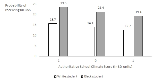
Now replicating that in R seems pretty straightforward. However, several small details require some manual specification.
First, let’s provide some data to plot:
x <- c(-1, 0, 1)
Black <- c(23.6, 21.4, 19.4)
White <- c(15.7, 14.1, 12.7)
df <- data.frame(x, Black, White)
df
## x Black White
## 1 -1 23.6 15.7
## 2 0 21.4 14.1
## 3 1 19.4 12.7Typically, this is what your data will look like when plotting in Excel. However, we will use ggplot2 and will require our data to be in a tall format (vs. wide). We can just reshape that using the melt function in the reshape2 function. (I have not jumped on the tidyr bandwagon yet).
library(dplyr)
library(reshape2)
library(ggplot2)

tall <- melt(df, id.vars = 'x', variable.name = 'Race', value.name = 'oss')
tall
## x Race oss
## 1 -1 Black 23.6
## 2 0 Black 21.4
## 3 1 Black 19.4
## 4 -1 White 15.7
## 5 0 White 14.1
## 6 1 White 12.7Drawing a basic bar plot can be done using the following code (using position = `dodge` has always seemed strange to me):
ggplot(tall, aes(x = x, y = oss, group = Race, fill = Race)) +
  geom_bar(stat = 'identity', position = 'dodge') +
  labs(x = "Authorititative School Climate score (in SD units)",
       y = 'Probability of \nreceiving an OSS') + ylim(0, 25) +
theme_bw() 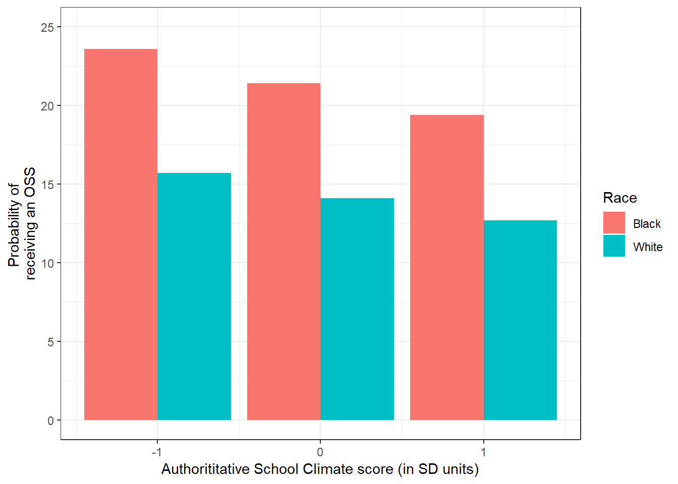
However, this is using the defaults and the colors may not be optimal when preparing a plot for a black and white publication. Note as well that the y-axis label is rotated and the legend is on the right. Also, there are no data labels.
Adding the text can be specified using geom_text
ggplot(tall, aes(x = x, y = oss, group = Race, fill = Race)) +
  geom_bar(stat = 'identity', position = 'dodge') +
  labs(x = "Authorititative School Climate score (in SD units)",
       y = 'Probability of \nreceiving an OSS') + ylim(0, 25) +
  theme_bw() +
  geom_text(aes(label=oss),
  position = position_dodge(width = 0.9), vjust = -0.5)
Having an unrotated y-axis label can be done as well using the
 theme specification below (I have not figured out how to make it left aligned).
ggplot(tall, aes(x = x, y = oss, group = Race, fill = Race)) +
geom_bar(stat = 'identity', position = 'dodge') +
labs(x = "Authorititative School Climate score (in SD units)",
y = 'Probability of \nreceiving an OSS') + ylim(0, 25) +
theme_bw() +
geom_text(aes(label=oss),
position = position_dodge(width = 0.9), vjust = -0.5) +
theme(axis.title.y = element_text(angle = 0)) 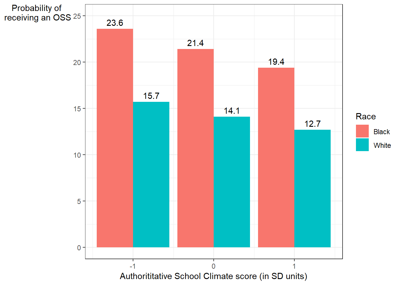 To get the fills to be black and white (and changing the legend title as well, we can use the
 scale_fill_manual option):
ggplot(tall, aes(x = x, y = oss, group = Race, fill = Race)) +
  geom_bar(stat = 'identity', position = 'dodge') +
  labs(x = "Authorititative School Climate score (in SD units)",
       y = 'Probability of \nreceiving an OSS') + ylim(0, 25) +
  theme_bw() +
  geom_text(aes(label=oss),
  position = position_dodge(width = 0.9), vjust = -0.5) +
  theme(axis.title.y = element_text(angle = 0)) +
  scale_fill_manual(name = 'Student race:',
  labels = c('Black', 'White'),
values = c('black','white')) 
However, the plot is not yet correct. Since we used a white fill, the bar plot needs to show the outline of the bar. To do that, we need to specify the color of the bar (color = `black`) in the geom_bar section.
ggplot(tall, aes(x = x, y = oss, group = Race, fill = Race)) +
geom_bar(stat = 'identity', position = 'dodge', color = 'black') +
labs(x = "Authorititative School Climate score (in SD units)",
y = 'Probability of \nreceiving an OSS') + ylim(0, 25) +
theme_bw() +
geom_text(aes(label=oss),
position = position_dodge(width = 0.9), vjust = -0.5) +
theme(axis.title.y = element_text(angle = 0)) +
scale_fill_manual(name = 'Student race:',
labels = c('Black', 'White'),
values = c('black','white')) 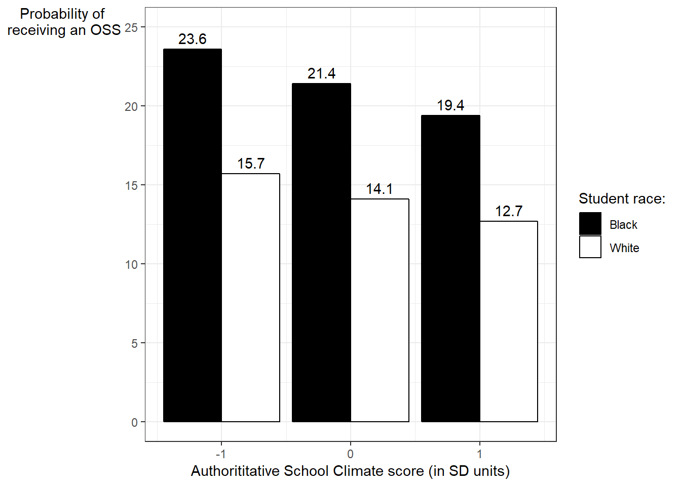 Last, we can move the legend position to the bottom (by making an addition to the
 theme):
ggplot(tall, aes(x = x, y = oss, group = Race, fill = Race)) +
  geom_bar(stat = 'identity', position = 'dodge', color = 'black') +
  labs(x = "Authorititative School Climate score (in SD units)",
       y = 'Probability of \nreceiving an OSS') + ylim(0, 25) +
  theme_bw() +
  geom_text(aes(label=oss),
  position = position_dodge(width = 0.9), vjust = -0.5) +
  theme(axis.title.y = element_text(angle = 0),
        legend.position = 'bottom') +
  scale_fill_manual(name = 'Student race:',
  labels = c('Black', 'White'),
values = c('black','white')) 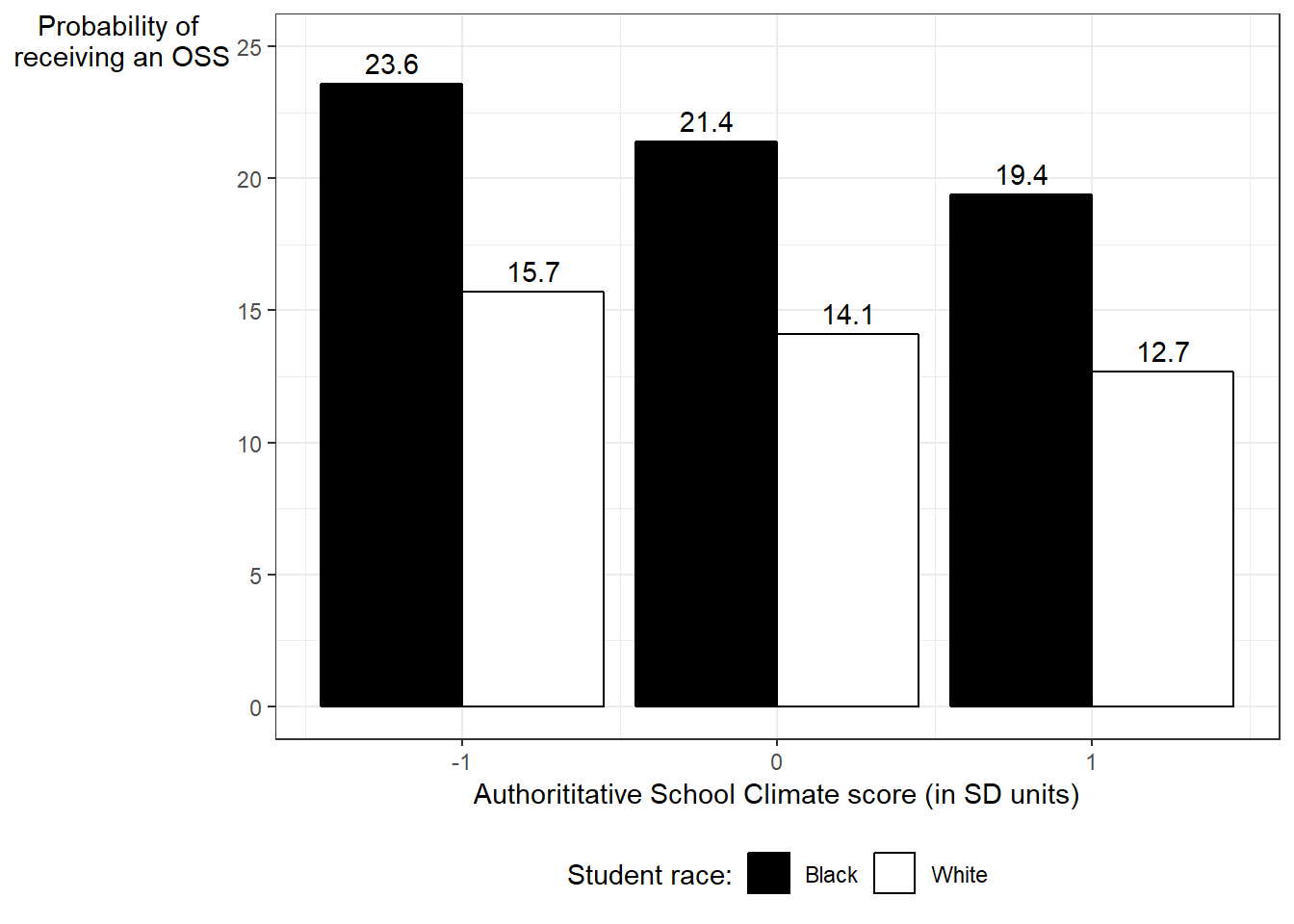
In the end, getting the chart to look a particular way (which is often taken for granted), requires several small tweaks. Each tweak of course requires some amount of Googling to figure out how it works. The time of course adds up but hopefully the next time I do this, this will be quicker.
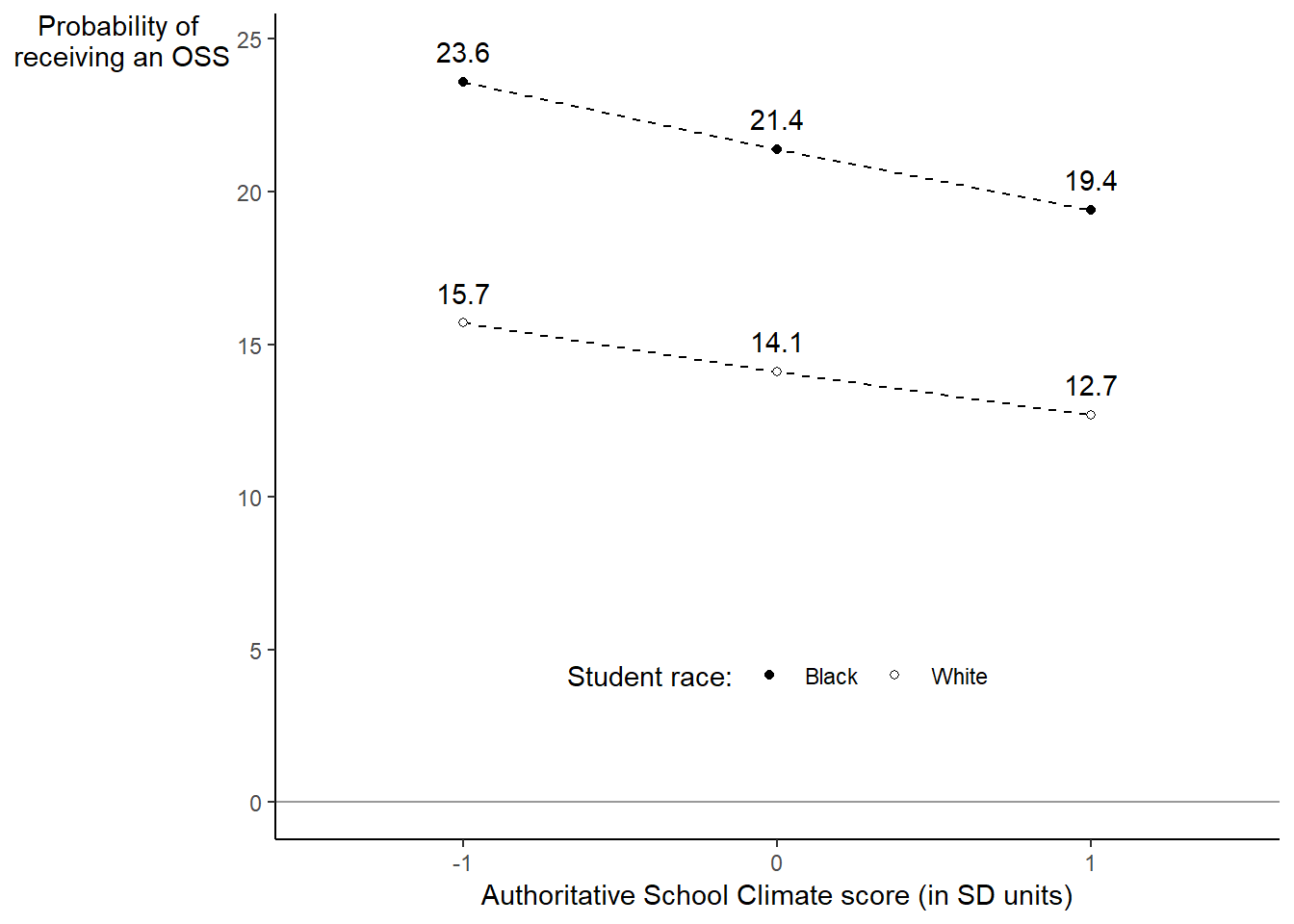
For those who don’t like bar plots, I ended up actually using geom_point instead with geom_line which also took a while to get “correct.”
ggplot(tall, aes(x = factor(x), y = oss, group = Race)) +
  geom_hline(yintercept = 0, colour = "grey60") +
  geom_line(linetype = 'dashed') +
  geom_point(aes(shape = Race, fill = Race)) +
  scale_shape_manual(name = 'Student race:',
  labels = c('Black', 'White'), values = c(21,21)) +
  scale_fill_manual(name = 'Student race:',
  labels = c('Black', 'White'), values = c('black','white')) +
  theme_classic() +
  geom_text(aes(label=oss), position = position_nudge(x = 0, y = 1)) +
  labs(x = "Authoritative School Climate score (in SD units)",
       y = 'Probability of \nreceiving an OSS') +
  theme(legend.position= c(.5, .2), legend.direction = 'horizontal')  +
theme(axis.title.y = element_text(angle = 0)) 